top of page

KYND
Branding
THE GROVE
BRANDING

YEAR
2025
2025
YEAR
TOOLS USED
Adobe Suite (Ai, Id, Ps)
Figma
TOOLS USED
SERVICES
Advertising
Art Direction
Brand Design
Advertising
Art Direction
Brand Design
SERVICES
SUMMARY
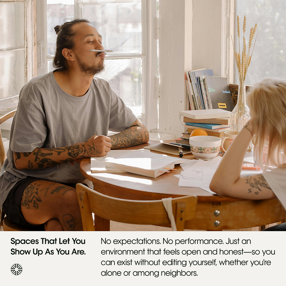
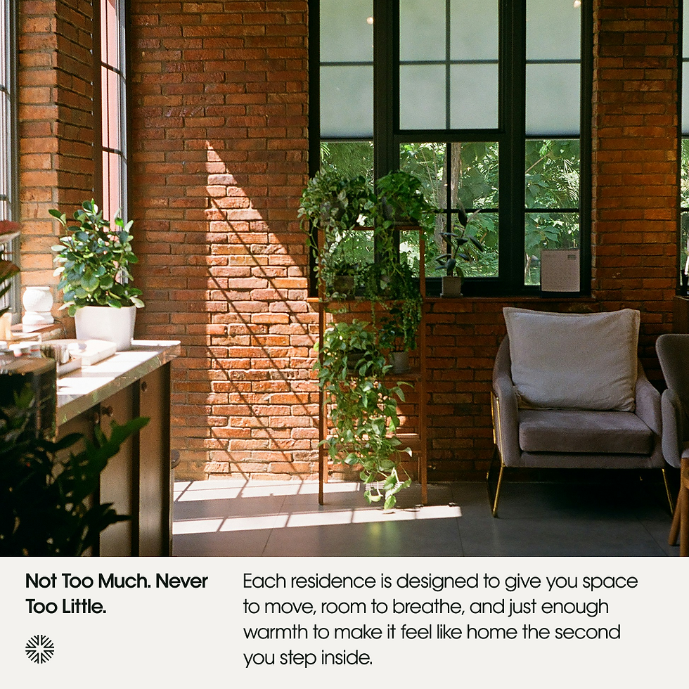
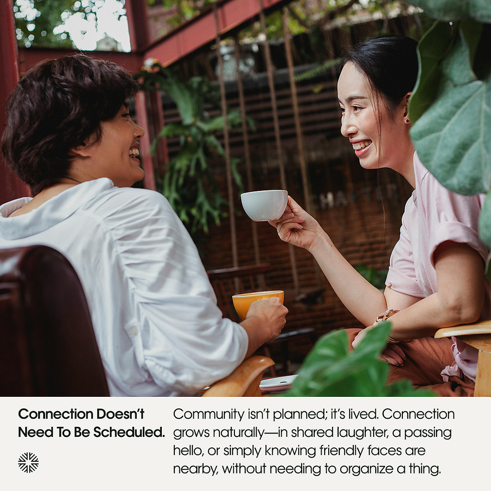
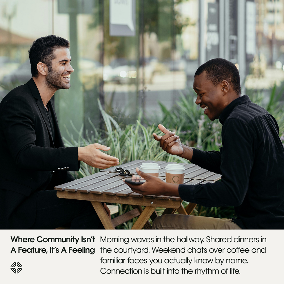
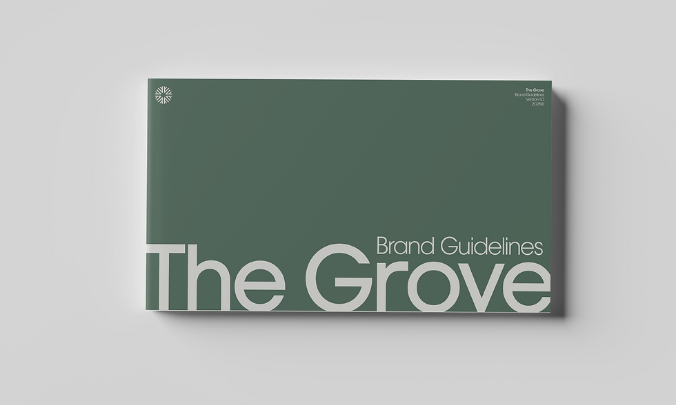
As a modern apartment community rooted in nature and centered on sustainability and connection, I designed The Grove’s full brand identity—including logo, color palette, typography, imagery, and voice—to reflect its core values and guiding themes.
As a modern apartment community rooted in nature and centered on sustainability and connection, I designed The Grove’s full brand identity—including logo, color palette, typography, imagery, and voice—to reflect its core values and guiding themes.
SUMMARY
Adobe Suite (Ai, Id, Ps)
Figma

The Grove’s logo pairs a custom wordmark based on Lubalin Recast Sans with a geometric logomark built from a single mirrored shape, repeated and rotated to form a four-part icon. Depending on orientation, the shapes evoke either branches or buildings, highlighting The Grove’s balance of sustainability and community.
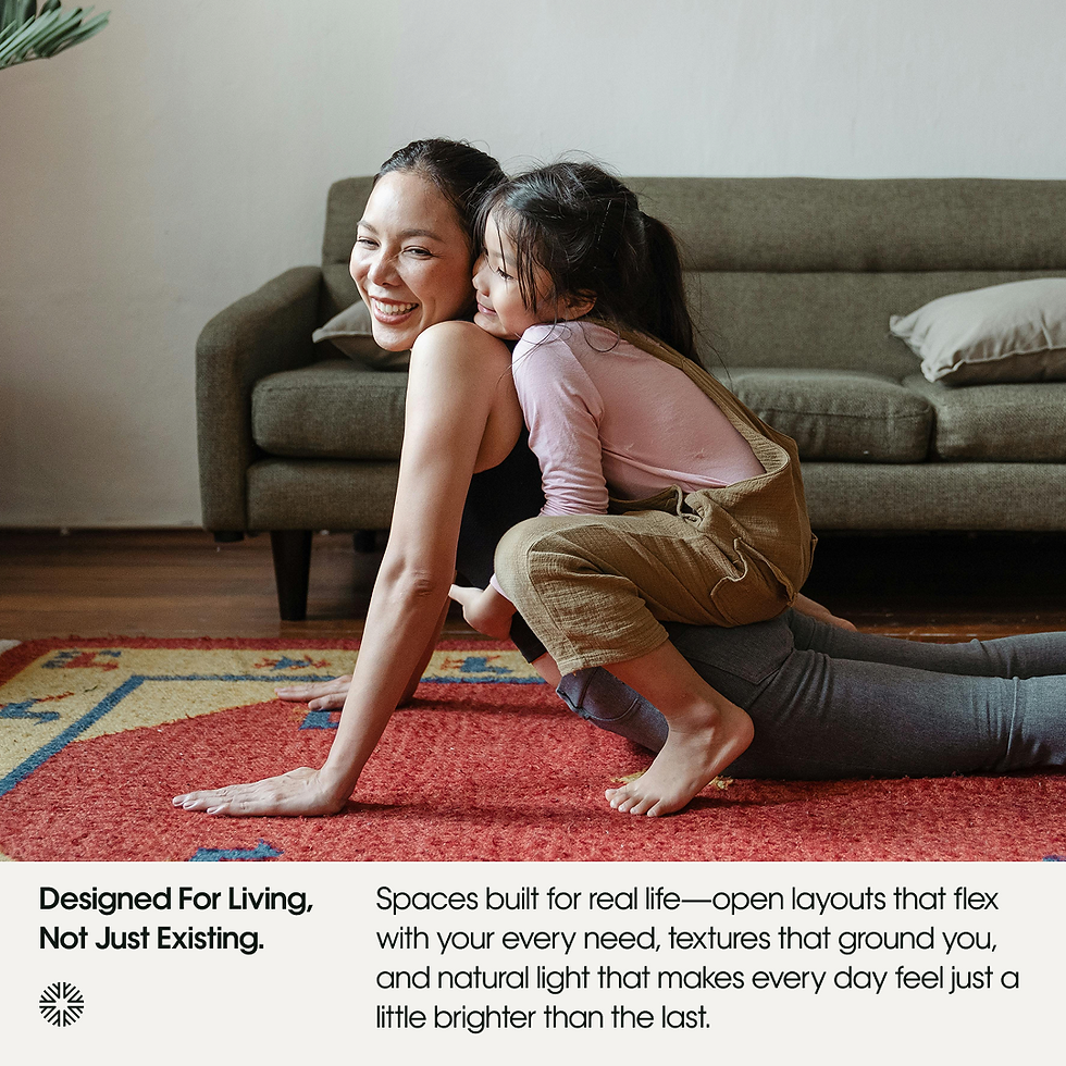
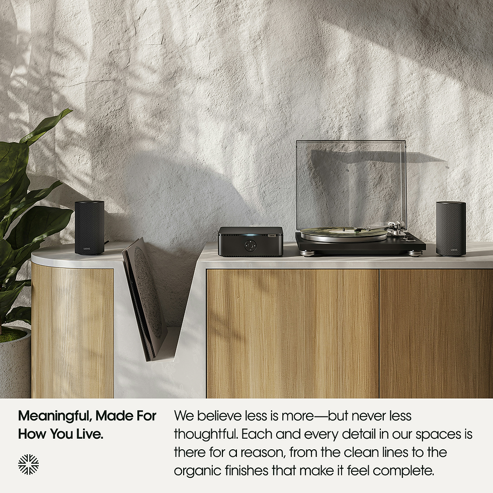
The Grove’s brand system emphasizes structure and clarity, using consistent grids, generous negative space, and a color palette that echoes its eco-conscious values. Bold headlines and copy take center stage across nearly all applications, supported by clean layouts that balance modernity with a sense of tranquility.


bottom of page

